This project builds off of some work that Tom and Matt did over last summer for an eco techniques course focused on open science, data visualization, and experiment design. We were trying to replicate an interesting interactive published by the New York Times on the Obama presidency. The main crux of this interactive is the idea of expectation vs. reality, how you think something is vs. what it actually is.
While this sentiment is important in politics, it is also important in science as well as you make, test, and prove/disprove hypotheses. The basic interaction is quite simple; you see a portion of a chart, then you fill in the rest of the chart based on your assumptions (your hypothesis).
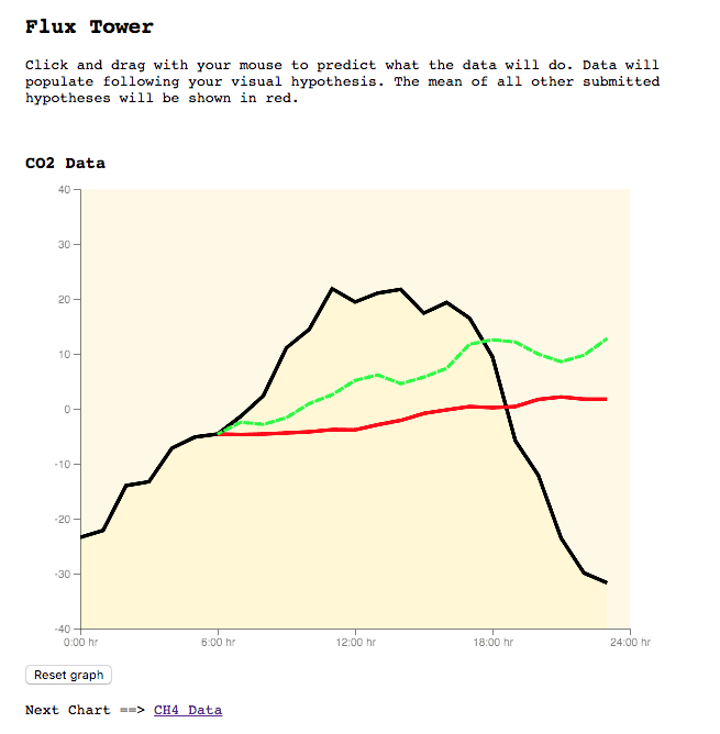
Once you’ve taken your position, the rest of the chart fills in with the correct data so you can see how close you are to reality.
However, we’ve talked about taking this one step further and projecting another layer of aggregation onto the chart. Right now, you can see how close you are to reality, but how close were you to the other people that went through the same experience. Is everyone underestimating or overestimating a position based on some variables, or is the trend clear to everyone interacting with this graphic?
How Does This Work?
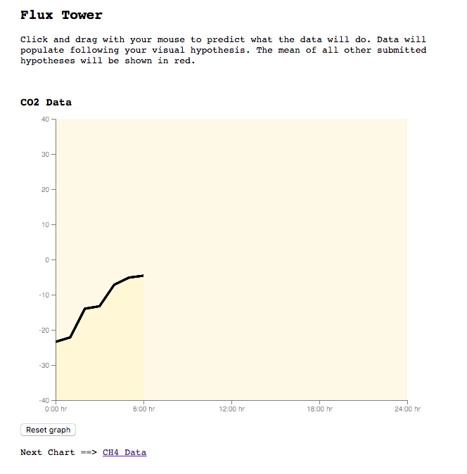
We start off with a simple chart drawn in D3 with a large portion of the data path clipped to hide it from the user. The black series here is data that we have from our Flux Tower source, so in other words this is ‘actual’ data.
From here, the user can interact with the chart and start to draw their hypothesis. Essentially, they are trying to guess where the data series will go based on the short snippet of the actual data they can see. As the user draws their line, a green dashed line gets drawn to the chart.
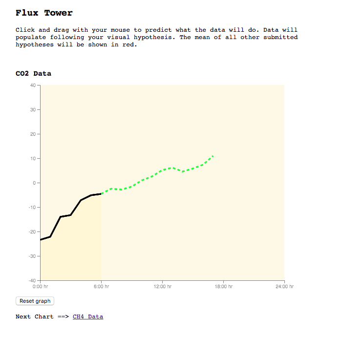
As the user draws their hypothesis, our JavaScript code is looking for the user guess to hold a specific amount of data points. That way, we don’t jump the gun and drawn the actual data or the aggregate hypothesis before the user has created a full guess.
Once we have those data points in the JS function, D3 animates the drawing of both the rest of the ‘actual’ data and the aggregate hypothesis data that is stored in Firebase.
Overall, there is some pretty cool code in this project, particularly the clipped path D3 chart stuff that Tom and Matt wrote last fall. Really, this addition piggybacks on their code and integrates Firebase to easily store the data for the guesses. None of that code is really crazy, but it is all nonetheless available in GitHub if you’re interested in looking at the guts of this project.