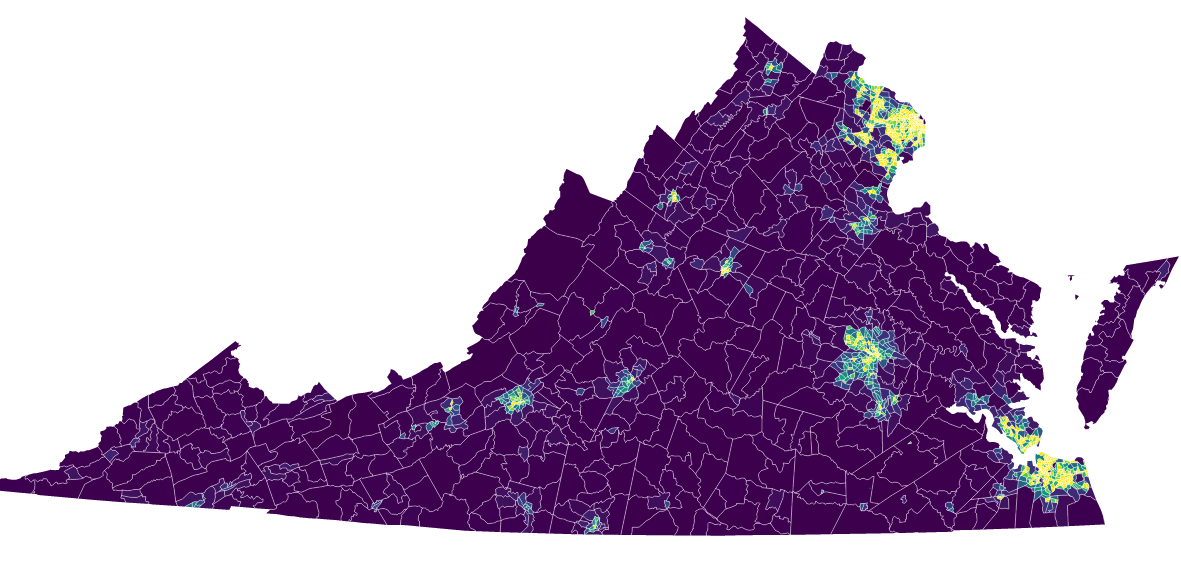
I’m not sure the power of visualizing data can be understated in the modern world. After all, we have more data than we’ve every had before, and we at least seem to understand the world we live in less and less. For example, this image below displays population density in Virginia census tracts, but what does that really matter and what does it mean?
Personally, I feel like as a practitioner of data visualization, my primary goal is to make data that are otherwise inaccessible to the average person meaningful within the context of our shared experience.
Sometimes this is easier said than done, for both technical and rhetorical reasons, but at the end of the day, constructing data visualizations at any level of sophistication requires a high level of rhetorical thought. Each piece involves its own narrative, whether implicit or explicit. Sometimes the data tells a story, but you can also tell a story with the data.
Typically, I opt for the former since it is a noncommittal approach, but something I’m going to try in future projects is to develop a clear thesis from the data to then illustrate and argue within the visualization itself.
I’ve been working a lot over the last few weeks with D3.js and different data sets tied to geographic features, so this is a quick debrief on a few of those projects with links to other resources.
Visualizing the Opioid Epidemic
For the first of my most recent forays into visualizing data with a geographic component, I chose to start with a broad context but a very specific data set. Using information from the CDC, I made a chloropleth (fancy word for a shaded map) documenting different statistics associated with the death rate from opioid overdoses.
You can find the GitHub repo for the project here and a live version hosted on my site here.
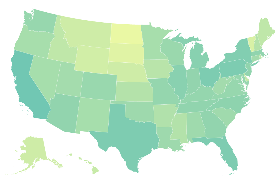
Since the purpose of this tool is primarily to serve as an open educational resource for students and teachers, I took a lot of time to build in options that would let them play with all of the variables associated with the data set. For example, the map looks very different when we look at total deaths by state vs. deaths per 100K residents by state.
I also built in a few options that let you alter the color scale that actually shades the map, as these are all choices that researchers make when trying to examine data and visualize it. Compare the image above, which uses a logarithmic scale to shade the areas, with the one below that uses a quantile scale:
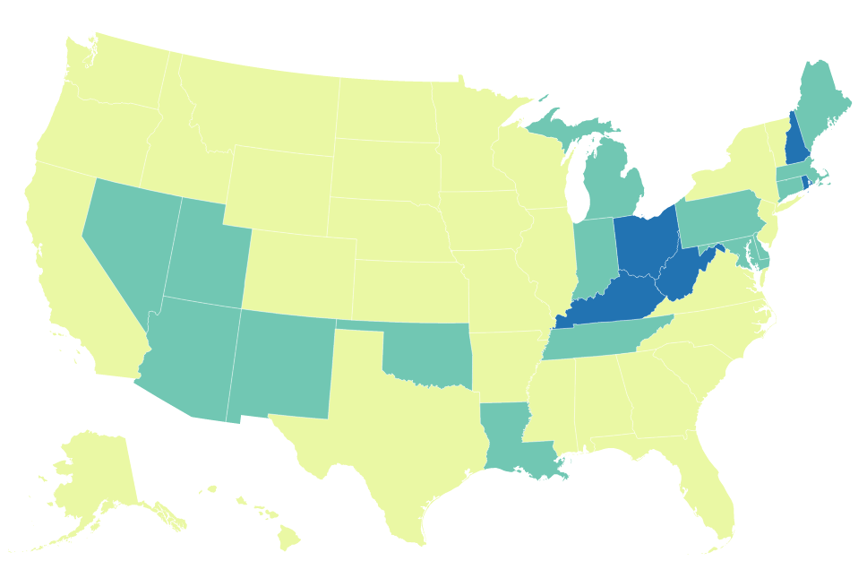
Both of these graphics are looking at the same numbers, but they tell two different stories. With the Log scale, we see much more variation between the states, but as a result that makes it difficult to really spot the problem areas, whereas with the quantile scale, there is less variation, but very clear buckets. Both are useful in their own right, but their usefulness also depends on the narrative you are trying to construct.
Despite the grim nature of the subject matter, this was a great project from a learning perspective. I’m pretty comfortable with D3, but this tested the limits of my knowledge in a few domains, cartography and stats being among them. Even the processing of multiple data sets into on final data set using Python was instructive for me on a number of levels.
Getting Granular with Population Data
After passing the opioid data viz around to some colleagues, the inevitable question arose of how granular we could get with this type of framework, so this next proof of concept attempts to answer that question. I’d seen chloropleths done at very high levels of specificity, and since D3 is really just drawing SVGs, I assumed it would visualize whatever level of geographic data (geoJSON, topoJSON) you threw at it.
Thus, the question wasn’t really can we do this, but rather how can we do this?
This is where I turned to the community for answers. I knew that if I could find an SVG or geoJSON file with all of the Virginia counties out there, I could copy that and combine it with my data set using Python like I’d done for the example above, but there had to be a better way.
What I’d been avoiding up until this point was dealing with geographic data from the source, in this case Census Bureau shapefiles. However, I found a tutorial series called ‘Command Line Cartography’ by the creator of D3, Mike Bostock, that walks you through this process in a pretty lucid and helpful manner.
You can find a link to the GitHub project repo here and a link to the live project here.
While there really isn’t as much interactivity with this visualization, from a technical perspective this data set was much more challenging to construct. Most of this work was done with the UNIX command line and the D3 command line tools outlined in the linked tutorial.
As an added benefit, I also got more acquainted with the API the Census Bureau maintains which has a host of data available at all levels of granularity.
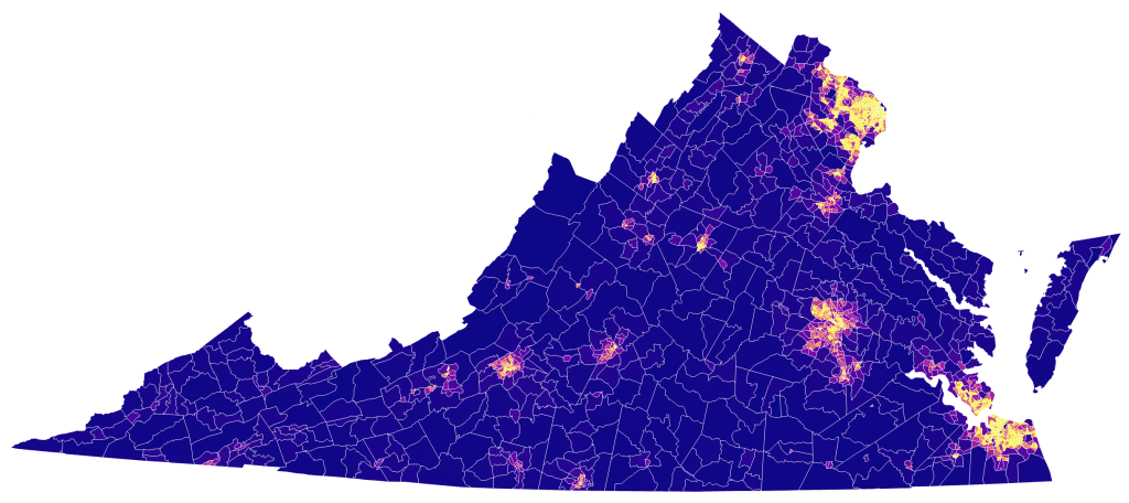
Creating this visualization using data tied to the census tracts, which vary wildly in area, generated a few more realizations about the practice of visualizing data at this level of geographic specificity. For example, even though each tract is tied to an event listener in the live example, from a practical standpoint there are some huge barriers to usability around the urban areas.
Each of the census tracts is structured to contain around 4000 residents, but in reality that means that each tract is as large or small as needed to contain around 4000 people. For some rural areas, that can mean many square miles, but in certain urban areas, that can mean areas of only a dozen blocks.
Because of this variation, some sort of zoom functionality is needed to make the urban areas inspectable. I know D3 supports that type of interaction, so I’ll work on building that into future iterations.
I just started in your site. I want to create a three dimensional perspective for city or area services in an area. This is for youth services handout maps for youth living on the street. I’m thinking of advertising brochures that show all hotels from an aerial perspective for example. Then there would be numbers on little building representations and a legend on the side. One goal of this style is to be friendly, simple, and reassuring. A two dimensional map has information also. Is this an artistic creation or is there a software package to do this?
To answer your question from a broad perspective, a map of this kind could be both artistic and created by software. Based on the fact that it needs to fit inside of a brochure, I’d recommend finding a graphic designer to contract with to design a map that includes all of the info you want/need to share.
A 3D map require more information to produce, and doesn’t really share a lot more information if elevation doesn’t matter at all to the data being displayed. There are lots of free GIS packages that would let you produce a graphic like the one you mention, but most of those are very difficult to use.
Google Maps is a great way to get started in an easy way. For example, the people in my office maintain one on free parking areas in the city of Richmond and share it with all of the new hires. It is very easy to add points of interest, that could help you collect all of the places you want to share. From there, however, I might recommend finding someone with graphic design chops to transfer your digital map to a physical document.
Thanks for reading, and feel free to comment back here with additional questions or thoughts.
JE