Continuing my exploration of data visualization tools, I circled back to where it all started for me: D3. For those of you involved in developing data-driven apps for the web, you most likely have a love/hate relationship with D3. You look at all of the cool examples and think, “Wow! That looks great,” but then try to pull your hair out once you actually try to make one yourself. At least that has been my pattern.
And after almost five years of this feeling, I can safely say not a lot has changed.
Nothing seems any easier from D3 v3 to v5, but maybe my tolerance for pain has gone up. Either way, only part of my desire here is to actually code bespoke data visualizations. In most cases, I’m just looking for a more compelling way to tell data-driven stories.
In a recent post, I explored some tools for data visualization in AWS, but Quicksight, while easy to use, wasn’t an ideal platform for sharing data analysis with the general public. Well, enter Observable, a Jupyter Notebook-like interactive data journal that uses JavaScript instead of Python. You can check out my evolving experiment here, but also check out some of the examples as they illustrate the power of the platform better than I ever could.
Below you’ll find a quick list of pros/cons based on my experience using other tools.
Pros of Observable
Overall, I was really impressed by this tool and what it made possible. In terms of creating readable data products, this provides a lot of support for what we call ‘explorable explanations.’ If you are looking for a full blown dashboard, Observable might not be the best platform, but if you want some expository text accompanied by JS-based data visualizations or maps, this is a great way to publish some stuff quickly.
You Can Make Complex Things
Observable lets you get as complicated as you want, as you can see by the graphic below. This was a set of geoJSON coordinates projected into SVG with a proportional symbol layer of census tract population. What a mouthful, but still something Observable is able to process and quickly render to the page. 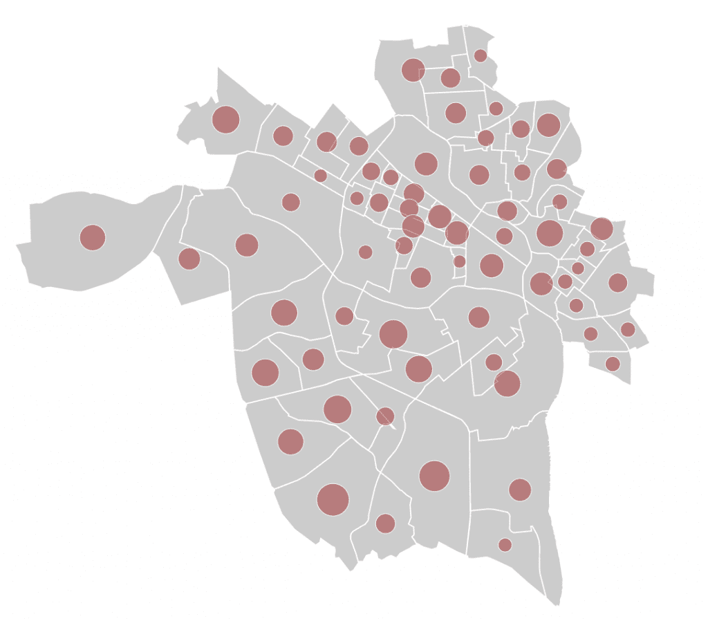
You Don’t Have to Use D3
Although most of the examples you can find use D3 to create visualizations, Observable is pretty agnostic when it comes to what types of code you want to run in your notebooks. As long as the packages are built using some form of JS modules or are available via NPM, you can use them in your work on the site. Check out this example using Google Maps for some details on how to make this happen.
You Can Create Beautiful Documents
In the past, most of my visualizations end up being one-off visualizations that exist on a webpage that may be fractured across on of my subdomain or various properties. See this visualization of missing children reports for an example. Usually, they are just the visualization itself without any context or expository text. While I could certainly add some additional text to each of these HTML pages, it isn’t always high up on my list. Now, with Observable this becomes a built-in format, so it makes it much more likely, for me at least, that I’ll include this extra context to round out my data explorable graphics.
The Process Is Clear
For most projects, the user can really only see the end result and not the process, unless you write some sort of accompanying blog post. For data science things, especially when we’re dealing with some type of data that needs to be cleaned, the process of cleaning and transforming the data can be as important as result itself. Using the Observable notebook, if we make those transformations as a part of the code in the notebook, people can see the process by which you arrived at your final product.
Cons of Observable
While there are obviously a lot of benefits of the Observable notebook, I find it only fitting to talk about some of the things I struggled with in creating my examples.
Difficulty Using Developer Tools
I’m sure this con would be diminished for someone more fluent with D3, or if I used a library or framework I can write with less trial and error, but I found prototyping somewhat more difficult than just using a local server. Part of this has to do with the fact that you are coding in an application that is also running in the browser, so things you log using console.log get mixed in with all of the things that Observable is already logging.
I have the same criticism with CodePen, but I also understand there is really no way around this given the way the technology works. If you are looking to simplify the development process, in terms of inspecting elements or using the JavaScript console, these types of tools make that piece difficult.
You Might Need to Up Your JavaScript Game
Over that last year, I’ve been trying to incorporate more ES6 and functional programming features into the JS code I write, namely using array methods like map, filter, reduce and handy things like template literals. As I started messing with more complex Vue apps, I had to learn more about modules and such. There are a lot of places where Observable relies on these cutting edge techniques, and that’s not to say there isn’t a way to develop “old school,” but rather that non of the examples are written that way.
For example, I had a tough time including a library that wasn’t written using the module pattern. In a regular visualization, I would have just included the script tag, and that would have been that. Not so in Observable. Now, again, that doesn’t mean you can’t, just that it wasn’t immediately apparent how to do so.
Conclusion
Overall, this was a really fun experiment that got me reacquainted with the newest version of D3 and added another tool to my tool belt. I think using Observable with a high-level library like Vega lite would be super productive. I’ll continue to play around, experiment, and report back to you, the good people of the internet.